A new problem has arisen, this time involving my rollover images. I wanted to put a wizards head next to the highlighted button, but for whatever reason Encore won't allow a fully coloured image to be used as a rollover effect. So instead I have decided to use a simple highlight on the buttons instead. At this stage I am just nit picking so it doesnt really matter anyways.
Above: The buttons I'm going to use for my Menu.
Friday, 19 November 2010
Thursday, 18 November 2010
DVD Menu Work 11 - AVI does work after all ¬_¬'
I just discovered that it actually was possible to use AVI files in encore after all. I don't know why i was told otherwise but it seems to have worked. I have started to link up all my menus and after tinkering with the aspect ratios I managed to make the menu look presentable. All that remains is for me to link up each screen and work some bugs out, but overall things seem to be going great.
Wednesday, 17 November 2010
DVD Menu Work 10 - Overlaying Buttons onto footage
I finally managed to overlay the buttons over a video clip! This means if i can import my finished movie file into encore i should be able to peice together my animated menu.
DVD Menu Work 9 - Problems importing into Encore
I'm having trouble importing the video clips into encore and overlaying the menu buttons. The main problem is that my video files apparently need to be in “.mov” format, which is annoying because I can’t seem to play these files on my computer. I'm following the tutorials but to no avail! I will continue to tinker until i have exhausted all possibilities.
DVD Menu Work 8 - Animating in Adobe Premier
I have decided to animate my menu in adobe premiere instead of photoshop because i feel there is more control over what the animation can do. I will then import the animation into encore and there I plan to overlay the menu buttons on top of the video clip. If everything goes correctly I should be able to make the video clips mesh together.
In the pictures below I have documented the process of creating the animations in Adobe Premier:
Premier is great for creating animations because it gives you complete control over almost every aspect of the animation. There are multiple layers to use so it doesn't get confusing when trying to animate something really ambitious, and the timeline ensures that you can make the clips last as long as you want.
I found this a lot better to use than Photoshops animation feature which is far worse because there is only one layer and things can get confusing when trying to animate more than one object. However it does have the advantage of not requiring me to add the menu buttons latter on in encore.
MUSIC
Another bonus of animating in Premier, is that I can also couple the music with the video clip so I don't have to add it later in Encore! Problem Solved before it was even a problem!
As you can see here, Premier gives you complete control over the animating process and once you know how to use it, it becomes relatively simple to create some great animations:
I am aware that if I didn't have Premier installed on my laptop, then creating an animation of this quality probably wouldn't have been possible for me but seeing as I did, I felt I may as well use it.
The only problem that remains now, is importing the video files into encore and overlaying the menu buttons on top of the video clips. If that goes well I should have a great looking DVD menu!
DVD Menu Work 7 - Finished Menus
I have created my menu in photoshop and now It's on to the tricky part of animating it in Adobe Premier...
My film is called "WIZARD PEAKS" As you can see I have yet to create the Menu buttons in Encore.
Above is what will happen when the user presses the "Play" button. The scene will change as the castle rises out of the ground and then fade to black as the movie begins.
DVD Menu Work 6 - Moodboard and Characters
Having finished my Moodboard for a childrens animated film, I have moved on to planning how i want my dvd menu to look. I've started designing characters and brainstorming what kind of animations i will use for my menu.
Here's my moodboard for a childrens animated film:
As you can see here, I have selected a wide range of characters to use on my moodboard.
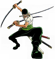
The type of person the animation is aimed at greatly effects the style of the animation itself. Here I have chosen two characters that I feel shows this. Zoro (left) looks a lot darker and accentuated then Patrick (right) this is because Zoro is from an animation aimed at a teenage-Adult audience, where as Patrick's audience is primarily young children. The shading and detail on Zoro is high because the audience is more developed, whereas Patrick has no shading and looks rather 2D in comparison.
After taking this into account I created some characters in Photoshop:
I like how this came out, but it doesn't seem to really fit the style of my menu so I tried again to make something a bit less serious and I came up with this Wizard here:

Subscribe to:
Posts (Atom)


